Nesting Part 2: The Nursery
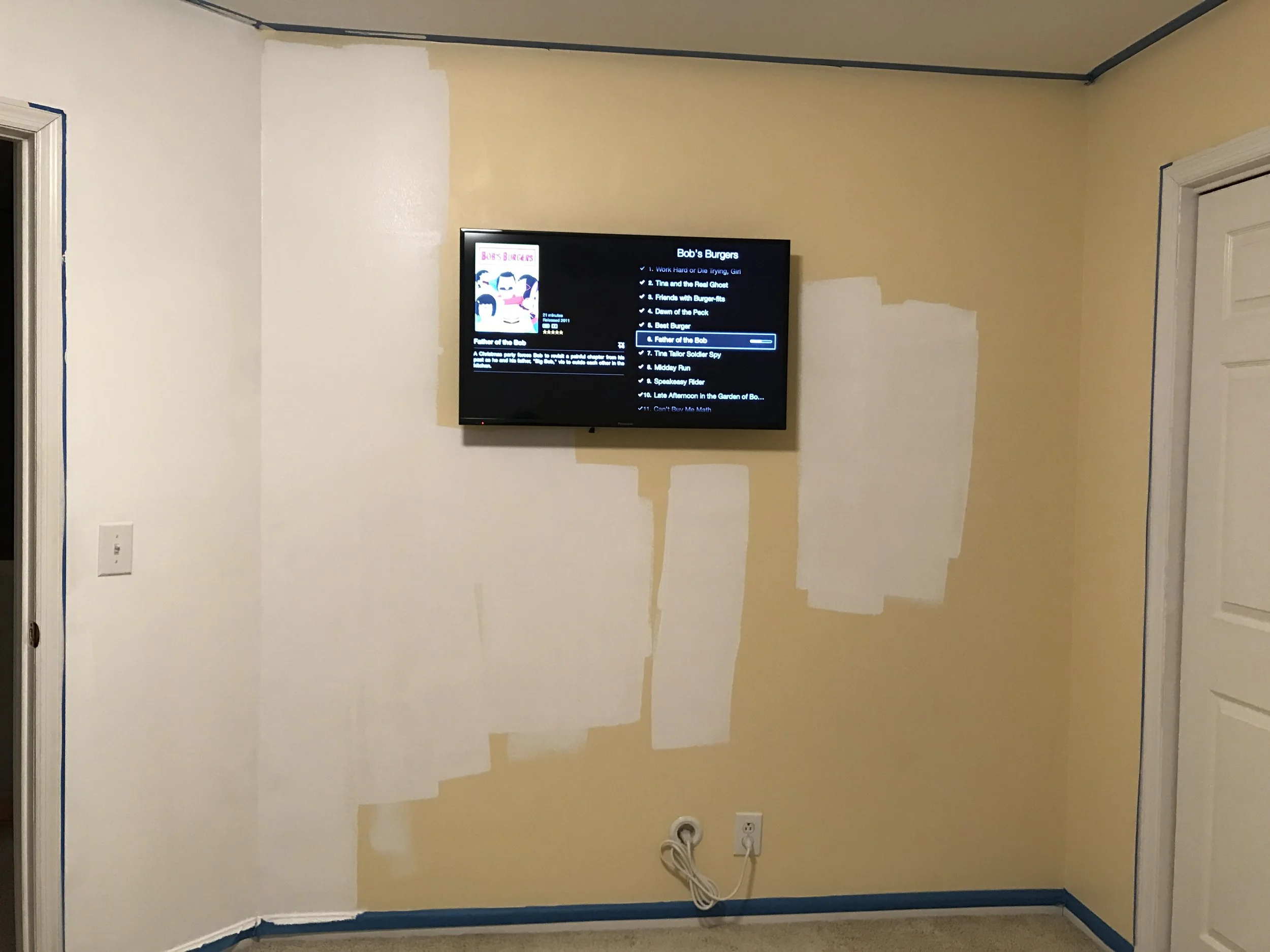
The Husband and I moved into this house in 2005 about 9 months before we got married. Where the nursery is now was, since we moved in, a glorified storage room. We stuffed everything we could in there and it got more and more tetris-y as the years went by. It was also our workout room for a while so we had a tv mounted to the wall. But every available compartment/shelf/closet was stuffed.
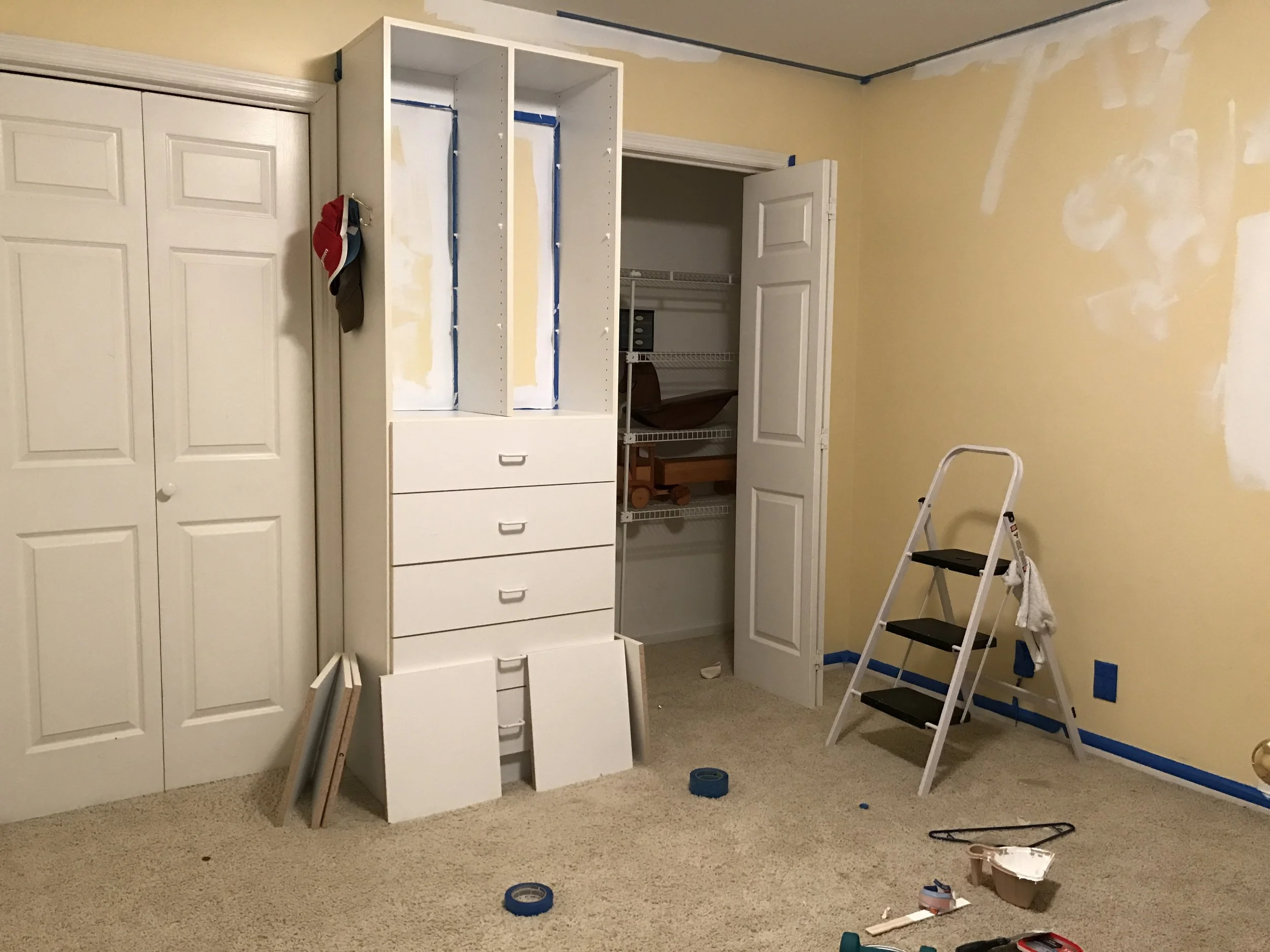
The previous owners had turned it into a nursery and it's also the smallest bedroom in the house. The walls were yellow and it was carpeted (The entire second story is carpeted). The nice thing about it is that it has two built-in closets and some wall shelving and a dresser.
It was a fine space but in desperate need of updating.
I actually enjoy painting but I'm also not a very disciplined painter and I like to pay a bit more to get the paint+primer combo. PS do splurge a bit and get a good brand of paint. I used Behr Marquee paint and primer and it SUCKED. One coat guarantee my butt; it took three whole cans and almost three coats to cover up the damn yellow. It wasn't even a dark yellow.
Also, people kept asking me if I had a theme for his nursery and seemed perturbed that I didn't. Don't be surprised when people ask you too and if you have a theme already picked out, that's great, I'm just not that kind of person. It was partly because I couldn't wrap my head around picking a theme and also, he's going to grow up and want his own theme. My first theme was "Not this damn yellow!" and I turned the whole room white.
We had the carpet torn up and put laminate down, and I replaced that boob light with something less fugly from West Elm.
I left the rest of the walls bare so I could put up art. If I had to name this theme, it'd be "modern nursery with a black/white/grey color scheme." I figured his toys were going to be plenty colorful as were his books so I didn't want to overwhelm his senses (or ours) with colors.
Here's what it looks like now. Ashtin Paige took some family photos for us and grabbed these detail shots and I love love love them so. You should hire her to take your family portraits, she is fantastic.
While on our babymoon to New York, The Husband saw this Keith Haring piece he liked and I managed to find the vinyl wall covering online and covered one wall with it. The Hamilton quote is a gift from a dear friend who knows my obsession with the musical.
The glider is from Wayfair. It took me forever to decide on one because I let myself get caught up in reviews. I took the plunge and ordered this one and so far I like it a lot. It's not too wide that I can have my arms supported while nursing and not too narrow that someone bigger than me couldn't sit in it. It swivels and it also reclines. The changing table is from Ikea and it was fine for a few months but Theo outgrew it. It's nice and light and compact but we now use this one.
Facing the Keith Haring wall is his crib. I thought it'd be overkill if I placed his crib at the really wild, black and white wall so this one's bare and I painted that bunny thing over the crib. Yes, those are Harry Potter sheets. Etsy is a wonderful thing that feeds my obsession with Harry Potter and Hamilton.
The crib is also from Wayfair (it was also available from Target but Wayfair had free shipping). I actually ended up buying a ton of things from Wayfair. The mobile is from Pottery Barn Kids.
I had initially wanted to put curtains up but decided to just leave the blinds. At some point I'll install blackout curtains but not till I can find nice ones that are short (that he can't tug on).
We're clearly still using the room for storage space as evidenced by the not-kids books at the top!!
When we had these pictures taken Theo was about six months and was still sleeping in our room so I wasn't quite done decorating but now we have a grey playmat that looks like a rug down on the floor and tons more books on the shelves and toys scattered around. It's a lot more colorful and lived-in now and we spend a lot of time in here.
Happy nesting!


